SHUTTERFLY
WEB DESIGN
Overview
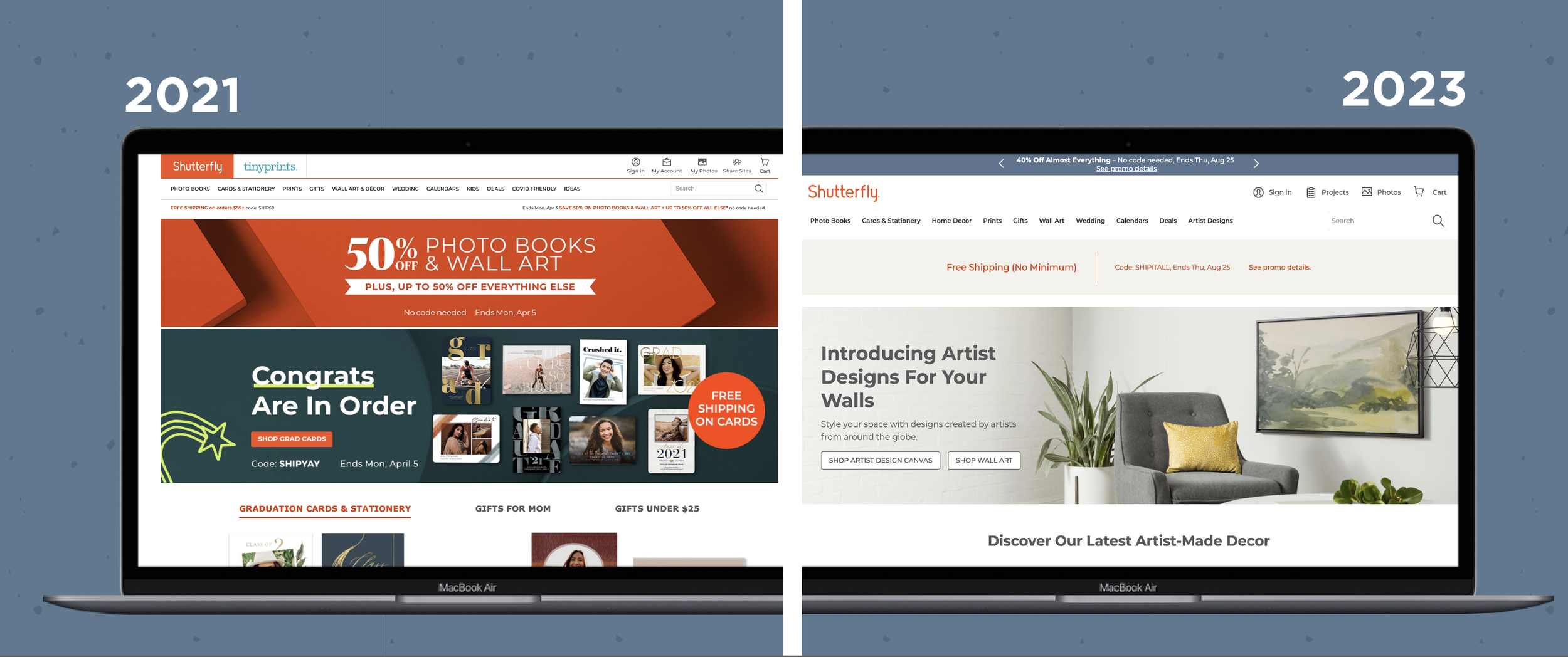
Shutterfly is an established brand that has struggled to build a cohesive brand look. The website had a lot of moving parts and was constantly being changed, leading to inconsistencies and making it hard for there to be any ownability. My team at Shutterfly was tasked with simplifying and cleaning up the website so that it was easier to navigate and creating a more consistent brand.
Result
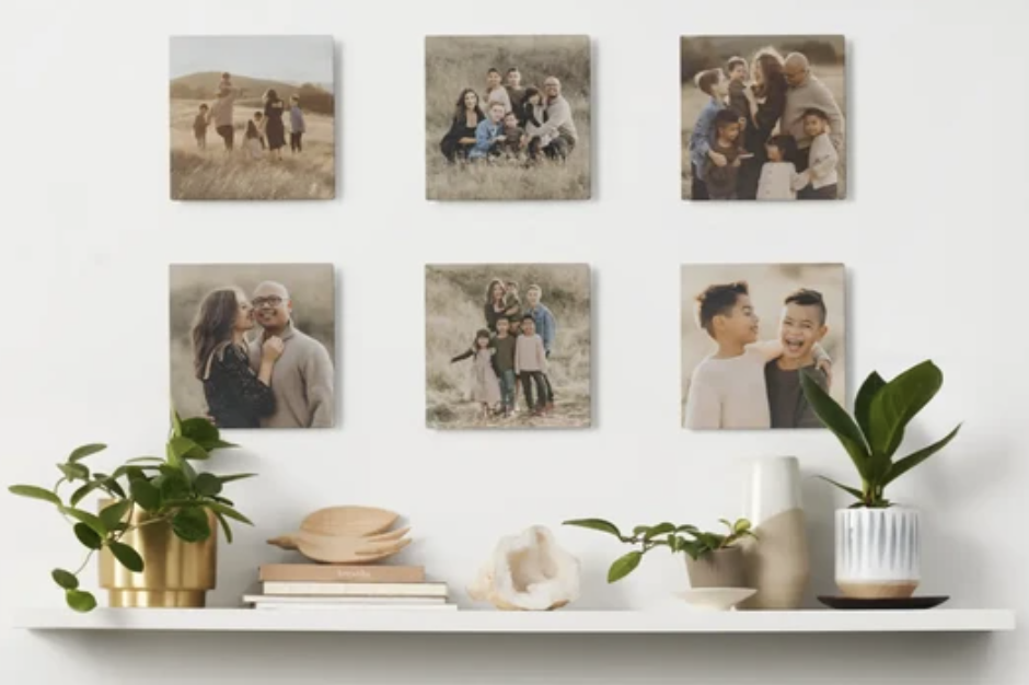
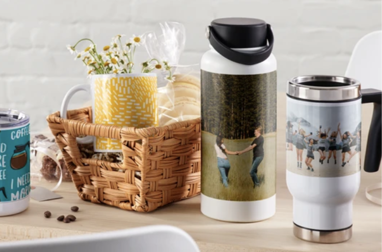
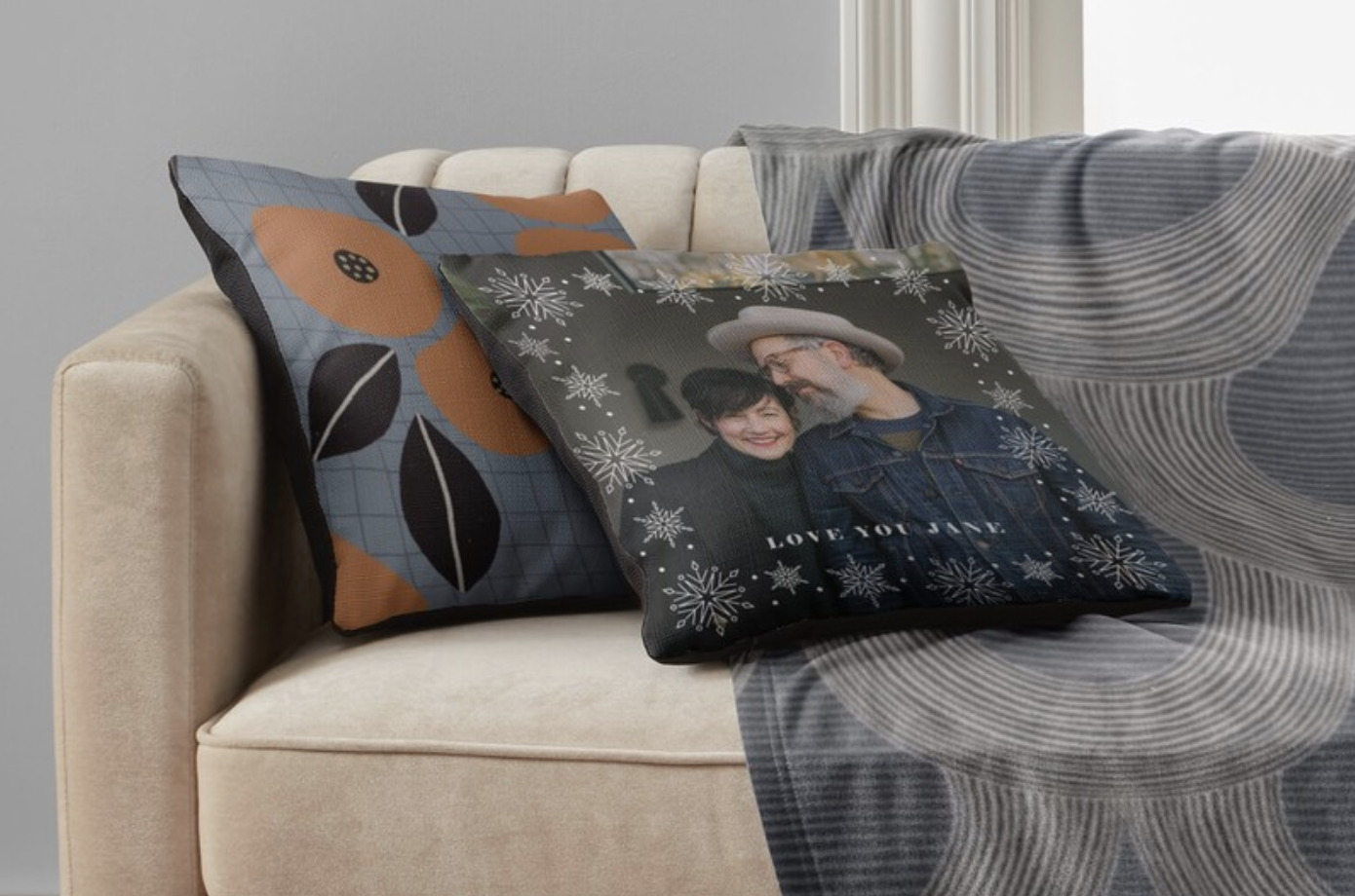
We dialed back a lot of the distractions that were previously on the site and let the photography be the hero. By using less color, eliminating some of the design elements and updating the photography we were able to make the site feel more current while still highlighting the products offered by Shutterfly.
Creative Direction: Susan Dreiling
Art Direction: Megan Kerber

Web Simplification
Shutterfly’s web design previously depended on individual campaigns. By establishing an overall look and feel for the site itself, we could incorporate these campaigns as needed, keeping the site fresh by adding pops of color from each campaign instead of re-designing the site for each holiday season.

Web Components
Moving to a new CMS allowed us to simplify and establish consistency in our marquees and components.
Updated Photography
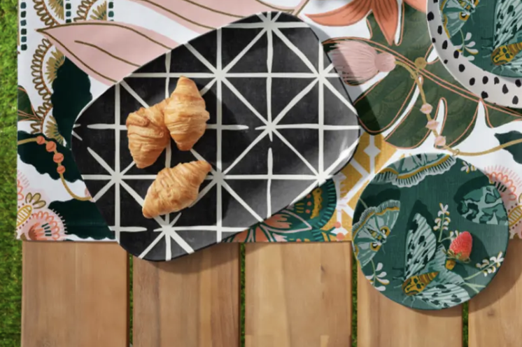
Switching from product based photography to environmental photography allows the consumer to feel more connected to the product and makes the overall site feel clean and modern.


